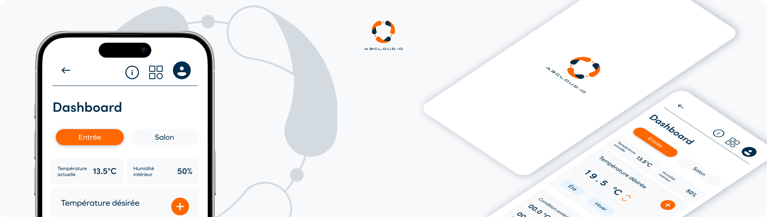
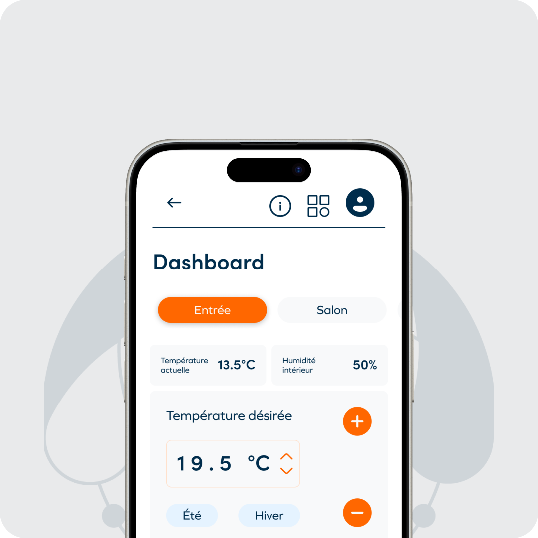
A3CLOUD.io
A3CLOUD.io is a web platform that enables users to monitor and control connected heat pumps remotely. It provides a clear and ergonomic interface that allows users to track performance, manage energy consumption, and optimize comfort while simplifying maintenance operations for technicians. The platform aims to bridge the gap between technical efficiency and a seamless, human-centered experience.
Context & problematic
A3CLOUD.io was created in the context of a growing demand for smart energy management solutions. Both private users and field technicians required a single, reliable interface to access real-time data, monitor device performance, and perform adjustments remotely. However, the previous interface was fragmented and visually overloaded, making navigation and data interpretation difficult.
The challenge was to design the platform to meet two distinct needs: providing simplicity and readability for end users, and ensuring technical precision and control for maintenance teams. The main question that guided our work was:
How can we create a single interface that remains intuitive for everyday users while being powerful enough for professional technicians?

Role & responsability
As a UX-UI Designer, I was responsible for analyzing the existing interface, identifying pain points, and proposing a new, user-centered structure. I led the UX research phase, redesigned the navigation flow, and developed high-fidelity mockups on Figma.
My responsibilities included:
- Conducting an UX audit of the existing product
- Interviewing users and technicians to collect insights
- Redesigning the information architecture and navigation model
- Creating wireframes, mockups, and prototypes
- Building a scalable design system to ensure consistency and maintainability
Throughout the project, I worked closely with developers and product stakeholders to align design decisions with technical and functional requirements.
Design process
The design process for A3CLOUD.io followed an iterative and user-centered approach, combining research, structural redesign, and interface refinement. The main goal was to simplify the interaction with connected heat pump systems while maintaining the technical precision required by professionals.
1. Understanding user needs
We began by analyzing the existing platform to identify usability issues and friction points. Interviews with both technicians and end users helped us better understand how they interacted with the system, their expectations, and their challenges in everyday use. This research revealed a strong need for clarity, visual hierarchy, and faster access to key information.
2. Structuring and optimizing the experience
Based on our insights, we redefined the user flows and reorganized the navigation to make data visualization and control actions more intuitive. The goal was to create an interface that offered different levels of detail depending on the user’s profile, balancing simplicity for end users and precision for technicians.
3. Designing a consistent and scalable interface
We then moved on to wireframes and high-fidelity mockups on Figma, focusing on readability, efficiency, and hierarchy of information. A complete design system was developed to ensure consistency across all components and facilitate future scalability. This included color and typography tokens, component states, and reusable patterns adapted to both desktop and mobile versions.